Technical AnalystSITS:VisionDisability SupportUniversity of LimerickLive Product
From the Back Office to the Student
The Disability Support Service exists to remove barriers. Their registration form was quietly creating them.This is the story of how a backend migration task became an accessibility-first UX transformation and what I learned about designing for the people who need it most.
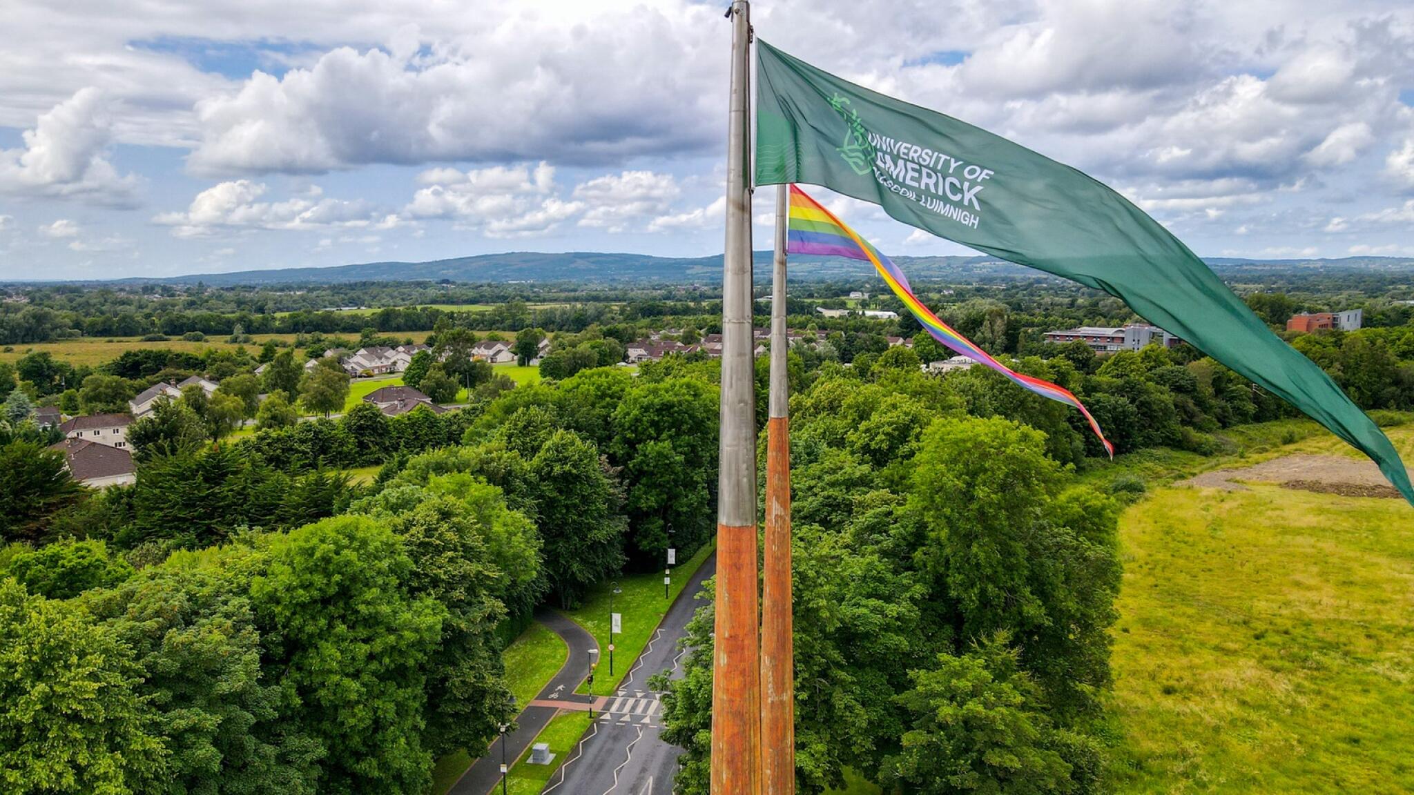
Disability Support Services, UL
UX Audit - Programming Analyst
Aug - Nov 2024
18,000+ students
Research
It started as a technical ticket. It became something much more.
I was assigned to a backend migration project at the University of Limerick, updating how student data was referenced across the Student Portal. My module was Disability at the time. The plan was simple: update the address references accross the system, log it as done and move on.
But when I sat down with the Disability Support Service team, I started asking questions. And what I found was a registration process that had been quietly failing the students who depended on it most.
What followed was a ground-up redesign, built on user interviews, accessibility principles, and a genuine belief that the people navigating this form deserved better.
18,000
Students enrolled at UL
5.5%
students Registered with DSS
9
Disability categories supported
4
DepartmentsDSS coordinates with
drives
77%
Institutional completion target
UL's target completion rate for students with disabilities by 2027/28; the institutional mandate this project directly serves.
DSS at UL serves one of the most diverse disability cohorts in Irish higher education. When mapped against national HEA benchmarks, the scale of who depended on this registration flow became impossible to ignore.
Official DSS page
22 form fields. students had no indication which were required or why the data was needed
No progress indicator. students couldn't tell how far through the process they were
Confirmation email implied completion. DSS still required a follow-up appointment that was never communicated
Discovery
The form that nobody had really looked at until now.
My original brief was narrow: update how student addresses were referenced in the backend. But before touching any code, I sat down with the DSS team and those conversations changed everything..
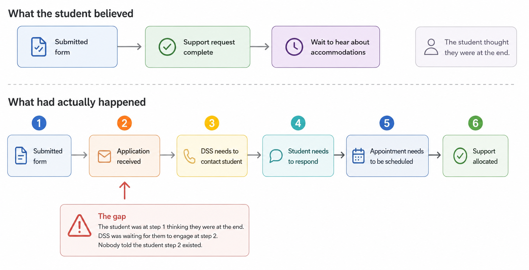
"Students would submit the registration form, receive a confirmation email, and go quiet. Days would pass. Then they'd follow up confused, sometimes frustrated having heard nothing. DSS would have to walk them back through the process manually, explaining that submission was only the beginning."
The students weren't being careless. The system was misleading them.
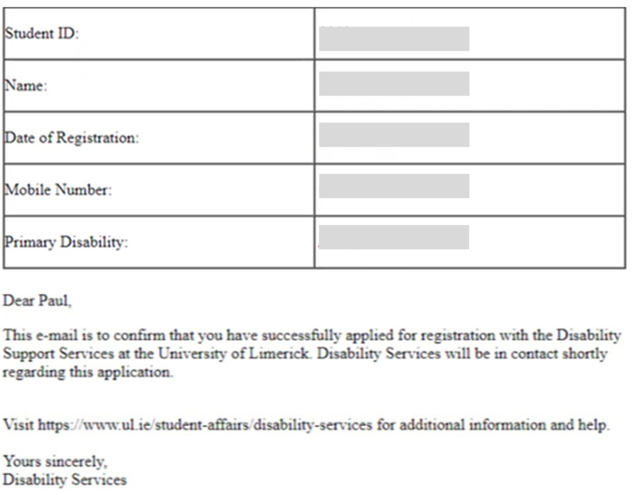
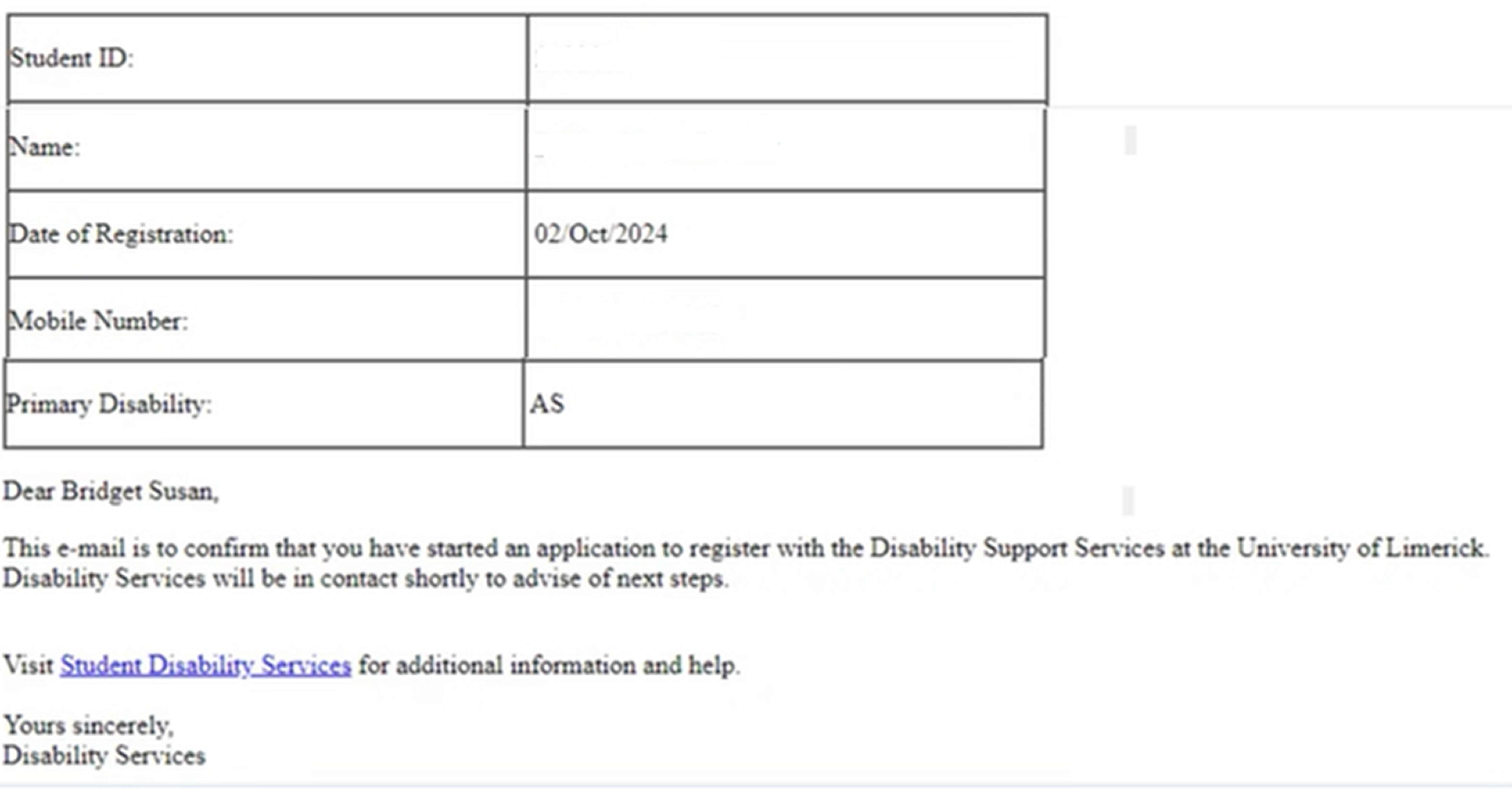
I pulled up the confirmation email they received after submitting.
Confirmation Email · Pre-design
It read: "This e-mail is to confirm that you have successfully applied for registration with the Disability Support Services."
⚠
Problem detected
"Successfully applied." For students already navigating the stress of disclosing a disability and asking for help, often for the first time, those two words landed as: you're done. The email offered no next steps, no timeline, no indication that DSS would need anything further from them. It closed a loop that hadn't actually closed.
This was the moment the project shifted for me. What I was looking at wasn't a backend problem. It was a communication failure: one that was falling hardest on the students who could least afford to fall through the gaps.
I widened my audit. If the confirmation email had gotten this so wrong, what else had been left unexamined?
DSS Registration · Pre-design
The language throughout was clinical and complex; a particular barrier for students with cognitive disabilities and international students navigating an unfamiliar system in a second language.
When errors occurred, the form gave no actionable guidance. Students were told something went wrong. Not what, and not how to fix it.
The tone made it worse. A system designed to support students was meeting their first mistake with urgency and pressure, precisely when they needed the opposite.>
Define
Naming the real problem.
The research pointed to one root cause: the system had never been designed with its actual users in mind.
Students with disabilities were navigating an outdated, inaccessible form that created confusion, incomplete submissions, and most importantly, a false sense of completion. How might we redesign this experience so that every student, regardless of ability, could register with clarity and confidence?
user journey map
01
Clarity over completeness
Collect only what is necessary. Every extra field is a question the student must answer and a reason to abandon.
02
Set expectations early
Never let a student wonder what happens next. The confirmation screen is not the end of the process, it should say so.
03
Design for the hardest case
If it works for a screen reader user , it works for everyone. Accessibility is not a constraint it is the baseline.
04
Language is a design material
Every word in the form is a UX decision. Plain language is not simplification, it is precision aimed at the reader.
Redesign Process
Six decisions that changed everything.
The research had given us a clear brief: reduce friction, set honest expectations, and design for the student who finds this hardest. Not the one who finds it easiest. Every decision below traces back to something we found in the field.
Before
22 form fields, many redundant
No entry point or orientation
Complex, clinical language
Vague overwhelming error messages
Misdirecting Confirmation email
No next steps communicated
After
6 fields, only what's needed
Clear entry point sets expectations
Plain language, scannable bullets
Specific, actionable error guidance
Confirmation email with next steps
Next steps clearly outlined
DSS Registration · Re-design
BeforeOld email · "Successfully applied"
AfterNew email · "started an application"
This was the root cause of the expectations gap, not a broken flow, not a missing screen, but two phrases that described the wrong thing. The fix wasn't a redesign. It was honesty.
Impact
Numbers first. Then the one that actually matters.
The redesigned form reduced fields from 22 to 6, a 73% reduction. Average completion time dropped by 30%. Across a student body of 18,000, served through 20+ departments, the cumulative effect of that reduction is significant.
30%
Faster average form completion
73%
Reduction rate of redesigned form
1
Mandatory field
But the metric I keep coming back to isn't on a dashboard.
After launch, the DSS team told me that students were arriving to their first appointment differently. They'd read the email. They knew what to expect. The back-and-forth, the follow-up calls, the manual re-explanations, the students who'd waited weeks not knowing they were supposed to do something had dropped noticeably.
That was the real measure of success. Not that the form was shorter. But that the system was finally telling the truth about what it was asking students to do.
Reflections
What this project taught me about designing for people.
01
What two phrases in an email taught me about design
The most impactful change in this project wasn't a redesigned screen. It wasn't the field reduction, the progress indicator, or the error handling. It was changing "successfully applied" to "started an application" and adding the words "next steps" to a single sentence.
That's it. Two phrases, across a change that took less than an hour to implement, that had been quietly failing students for however long that email had existed.
I hadn't thought of UX writing as design before this project. I do now. Every word in a system is a decision and an undecided word doesn't stay neutral, it defaults to whatever the system finds easiest to say. In this case, that was "successfully applied." Technically accurate. Practically misleading. The gap between those two things is where the confusion lived.
02
What my background gave me, and what it couldn't
Being a developer on this project meant I could move fast. I understood the system constraints before anyone explained them. I earned engineering trust early. I shipped without handoff friction. Those things mattered.
But I came to this project without formal UX training, which meant some things I should have done, I didn't think to do.
I interviewed DSS staff. I didn't interview students. The people who filled out the old form, the ones who waited weeks not knowing they were supposed to do something, I never spoke to them directly. I made design decisions on their behalf based on what staff told me, which is better than nothing, but it isn't the same thing. If I were doing this project again, I would find two or three students willing to walk me through their registration experience before I touched a single field. Their version of the story might have surprised me.
The question I want to keep asking
I came into this project as a developer who was curious about UX. I left it understanding something I hadn't expected: that the most valuable thing a designer can do isn't always to add something. Sometimes it's to remove a warning, shorten a sentence, or delete sixteen form fields that nobody needed in the first place.
The students who used the old DSS registration flow weren't failing. The system was asking them to navigate something that hadn't been designed with them in mind. Fixing that didn't require new technology, a bigger budget, or a platform migration.
It required someone to stop and ask: does this actually work for the people using it?