Ranisha Explores.

CV
Get in touch
UI/UX Specialist Figma Crypto Exchange Mexico · UAE · India · Argentina Live Product

Designing Trust for Crypto

KMBIO is a hybrid crypto exchange, combining the power of a centralised exchange (CEX) with the security of a decentralised exchange (DEX). I joined as a UI/UX Specialist after delivering a landing page that earned me a full seat at the table.

Client
KMBIO Exchange
Role
UI/UX Designer
Duration
Feb 2024 - May 2025
Deliverables
20+ Business Flows
How it started

A landing page that turned into a product

What began as a skills test, "design us a landing page", evolved into a 15-month embedded role as the sole designer on a live crypto exchange. Three distinct phases shaped the product.

01
February - March 2024
Phase 1: Landing Page & First Launch

Delivered an animated landing page with smooth scroll sections, and vector illustration system. The client loved the result and onboarded me onto their core team; working alongside engineers, legal counsel, a cybersecurity team, and marketing. The landing page launched as the public face of the product.

Landing Page · Phase 1
02
April - July 2024
Phase 2: Core Exchange Flows

Designed the primary financial flows for onboarding, KYC, and Buy Crypto; the end-to-end transaction flow connecting buyers to the liquidity pool. These flows were selected as the MVP showcase at KMBIO's official product launch event, demonstrated to investors and stakeholders, and received significant praise and early traction for the platform.

03
March - May 2025
Phase 3: Trading & Final Release

Completed the spot trading experience, P2P flows, staking, and remaining financial features. Final total: over 20 business flows, all designed, iterated, and deployed to production.

The challenge

Trust is the product

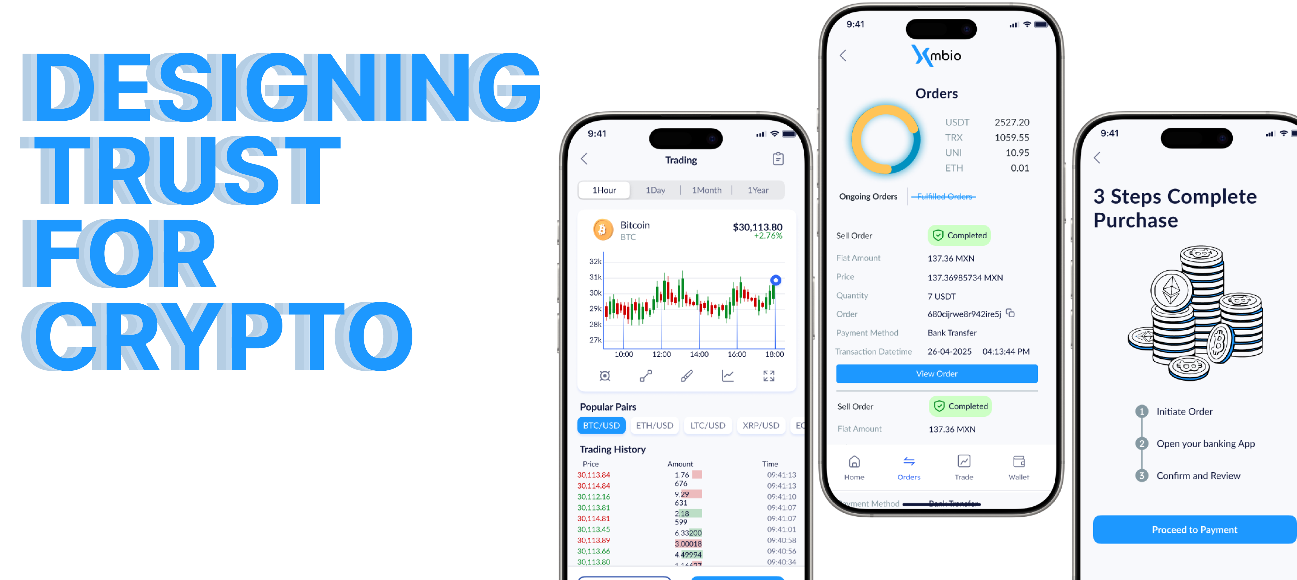
Focus group research revealed that users don't just struggle with crypto interfaces, they distrust them by default. Security breaches, scams, and confusing jargon had created an audience that was skeptical before opening the app. Designing for KMBIO meant designing against that anxiety at every touchpoint.

On top of user trust, I had an additional constraint few UX designers face at this stage: every word in the UI required approval from legal and cybersecurity. Instructions, warnings, disclaimers, confirmations; nothing shipped without review.

KMBIO app screens overview
Research

What the focus group told us

Research was conducted by the KMBIO team through focus groups across target markets. I used these findings to drive design decisions: translating user fears directly into UI choices.

01

Users compare crypto to traditional banking

Participants wanted the structure and safety cues of a bank app. Familiar patterns, i.e., progress indicators, confirmations, receipts built confidence where crypto jargon created doubt.

02

Transparency about fees and mechanics is non-negotiable

Users wanted to understand exactly how the platform makes money before trusting it with theirs. Hidden fees were a dealbreaker even in concept testing.

03

Text-heavy interfaces lose users fast

Trust in visuals over text was a consistent finding. Infographics, step-by-step visuals, and clean iconography built confidence more effectively than paragraphs of explanation.

04

Fear of missing out drives engagement; fear of losing drives abandonment

FOMO around hot trades boosted interest; loss aversion sent users away. The design needed to surface opportunity without amplifying financial anxiety.

05

The learning curve is a barrier, not a feature

Users wanted to learn by doing, not through documentation. Progressive disclosure, contextual tooltips, and guided onboarding were essential for first-time users.

The work

20+ flows, built from scratch

As sole designer, I owned the end-to-end experience across every flow; from wireframe through to handoff with the engineering team. Below are the most complex and defining flows of the project.

Launch

Designed for an MVP. Showcased at a product launch event.

The Phase 2 Buy Crypto flow was selected as part of KMBIO's MVP showcase at their official product launch event for a milestone celebration marking the platform going live. The onboarding and buy flow were demonstrated to an audience of investors and stakeholders, receiving significant praise and generating early traction for the product.

It was also the moment that validated the design direction before Phase 3 began.

UX writing

When every word needs a lawyer

In most apps, UX writing is a craft question. In a financial platform operating across four regulatory environments, it is also a legal and compliance question. Every instruction, warning, and error state in KMBIO was written in close collaboration with the legal team and reviewed under cybersecurity supervision.

The core tension: legal precision tends toward jargon and length; good UX writing demands brevity and plain language. Finding the intersection by writing that was clear enough for a first-time user and defensible enough for a compliance audit was one of the most distinctive challenges of this project.

"Writing clear instructions, warnings, and notices was not a secondary task. It was a core design deliverable."
Ranisha, UI/UX Specialist on KMBIO
KYC verification warning
Before
Your KYC has been initiated. You will receive an update within 24 hours.
After
Your KYC has been initiated. Please allow us a few minutes to verify. Click here to check status of your verification.
Buy Crypto Wait state
Before
Please wait while we are initiating your order. This usually may take five minutes as we are looking for a Liquidity provider to accept your order.
After
Please wait while we are initiating your order. This usually may take five minutes.
Phase 3 scope

Redesigning for a new system, at scale

The final phase wasn't a polish pass: it was a structural redesign. A backend system migration required every existing flow to be retested and rebuilt where needed, while the product simultaneously expanded with new features and shed others that no longer served users.

Three numbers define the scope: 37 flows tested and redesigned, 17 new flows built from scratch, 12 features retired on client direction. All designed, coordinated, and handed off by one designer.


From functional prototype to designed experience

The before state is a developer-built walkthrough of the P2P advert screen; functional end-to-end, but built from an engineering perspective. CTAs and buttons in place, flows working, no UX writing, no guidance, no hierarchy. P2P was not in design scope until Phase 3. The developer video served as reference to understand the system before designing the experience from scratch: structure, copy, hierarchy, and language approved by the legal and cybersecurity teams.


Before Developer prototype · Pre-design
Functional flow built by engineering team to demonstrate backend capability to client
No UX writing: buttons and CTAs only, no instructional copy
No visual hierarchy or step guidance for the user
After Phase 3 · Legal & cybersecurity approved
Plain language approved by legal and cybersecurity teams
Fee breakdown visible before user commits to the trade
Step-by-step copy guides Pro users through configuration with confidence
Design note: The before video was recorded by the developer to walk the client through working functionality. P2P was never designed for until Phase 3. My role was to take that working system and design the experience around it, i.e., structure, language, hierarchy, and compliance-approved copy.
Outcome

From test project to live product

37
Flows tested and redesigned for new backend system
17
New user flows added in Phase 3
12
Features strategically retired
3
Product phases across 15 months
4
Markets: Mexico, UAE, Argentina, India

KMBIO launched live at kmbio.ai/en mainly for LATAM market but is also serving users across Mexico, Argentina, India, and the UAE in English and Spanish.

Phase 3 alone involved 37 flows tested against a new backend system, 17 new user flows added to the product, and 12 features retired in collaboration with the client; a decision that reflected the product maturing, not shrinking. As sole designer across all three phases, I owned every flow from wireframe through to engineering handoff.

Designing under legal constraint makes a better UX writer. When every word is scrutinised, I became precise about what I actually meant and why.

Cross-functional trust as a design skill. Getting engineers, legal, and cybersecurity to say yes to your design decisions requires as much communication craft as the design itself.

Trust isn't one feature, it's the cumulative effect of everything. The loading state, the confirmation message, the error copy; every touchpoint either builds or erodes it.